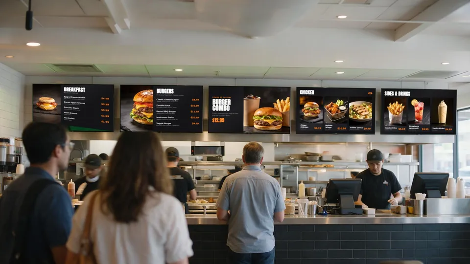
A menu board only works if customers can read it from where they actually stand — usually in line, several feet back from the counter. The right setup comes down to four decisions: how far away people read it, how big the text needs to be, how high the screens hang, and how many screens you split the menu across.
Quick answer: most counter-service restaurants use 43″–55″ landscape TVs mounted in a row so the bottom edge sits above head height of staff behind the counter, with the most important items in text large enough to read from the back of a typical line. For long lines or high ceilings, step up to 55″–65″ or add more screens rather than shrinking text.
1. Start with viewing distance, not screen size
Walk to the spot where a customer decides what to order — the back of a normal lunch line, or the door if people read the menu while queuing. Measure the distance to the wall where the screens will hang. That number drives everything else.
A common signage rule of thumb is about 1 inch of letter height for every 10 feet of viewing distance for comfortable reading. Item names and prices should meet that; descriptions can be smaller because people read them once they are closer.
| Typical decision distance | Item name & price height (approx.) | Common screen choice |
|---|---|---|
| Up to 8 ft (café counter, food truck window) | about 1″ | 32″–43″ |
| 8–15 ft (typical QSR line) | about 1–1.5″ | 43″–55″ |
| 15–25 ft (large dining room, long line) | about 1.5–2.5″ | 55″–65″, or more screens |
These are starting points. Fonts, contrast and how many items you squeeze onto a screen matter as much as the screen size.
2. Fewer items per screen beats a bigger screen
The most common mistake is putting the whole printed menu on one TV. A 55″ screen with 40 items forces small text; the same screen with 6–8 items and a hero photo is readable from across the room. Split the menu by category across several screens — burgers, chicken, sides and drinks, combos — so each screen has one job.
3. Mounting height
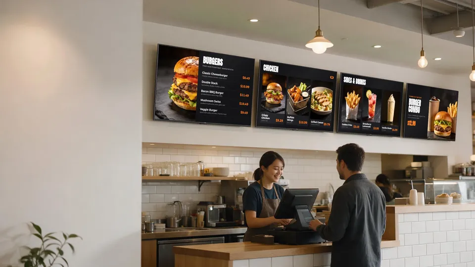
- Clear the staff: mount the bottom edge above the heads of staff working the counter so nobody blocks the board — in practice often around 6½–7 ft from the floor, depending on the counter and back wall.
- Don’t go too high: every extra foot of height makes customers in the front of the line crane their necks. If ceilings force a high mount, tilt the screens down slightly with a tilting mount.
- Line them up: mount a row of screens at one height with even gaps — it reads as one designed menu wall instead of scattered TVs.
- Watch glare: check the wall at the brightest time of day. Windows and pendant lights reflecting on glossy screens are the most common readability problem.
4. Landscape or portrait?
Landscape is the default for counter menu walls: it fits wide spaces above the counter and matches most menu templates. Portrait works well for narrow walls, entrance promos and drive-thru style boards. Whichever you choose, keep all screens in a group the same orientation and size.
5. Brightness and placement
Consumer Smart TVs are fine indoors in typical restaurant lighting. Screens facing large windows, outdoor patios or food-truck windows in direct sun need extra attention — angle them away from the sun, add shade, or consider brighter displays for those positions only.
6. Plan for growth: multiple screens and video walls
Rather than one huge TV, many restaurants run a row of matching screens. That makes it easy to dedicate screens to categories, rotate a promo screen, or tile one image across several TVs as a video wall. With KwickSIGN multi-TV control you can run anywhere from 1 to 99 Smart TVs from KwickPOS.
Pre-install checklist
- Measure the decision distance and wall width.
- Decide how many categories you need on screen at once — that is your screen count.
- Confirm power outlets and network (WiFi or ethernet) behind each screen.
- Pick mounts: fixed for eye-level, tilting for high walls.
- Mock up text at real size on one screen and read it from the back of the line before mounting the rest.